Close
About the project
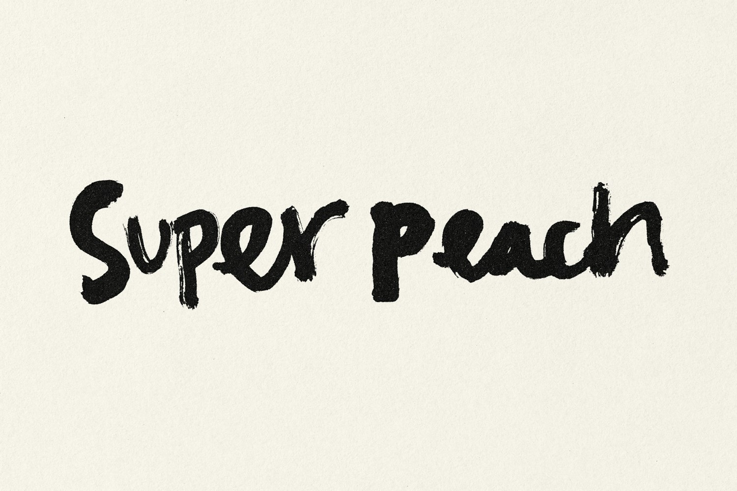
Established by chef David Chang in 2004, Momofuku began with the launch of Momofuku Noodle Bar in New York. The restaurant quickly gained recognition for redefining Asian-American cuisine and breaking traditional dining norms through a bold, inventive approach. Over the past two decades, Momofuku has expanded to more than 15 locations across North America, each reflecting Chang’s commitment to pushing culinary boundaries. Super Peach, situated at Westfield Century City in Los Angeles, represents the brand’s latest evolution. It translates Momofuku’s rebellious spirit into an all-day, upscale-casual dining concept, pairing efficient service with a format suited to everyday meals. The 196-seat venue is designed to feel lively and immersive, featuring a fish counter, open kitchen, and vibrant bar that create a constant sense of activity. Its menu reinterprets American classics through the Momofuku perspective, elevating familiar dishes with complex flavors and inventive techniques. Pentagram shaped the brand positioning and visual identity for Super Peach around the concept of contrast. The restaurant thrives on the tension between familiar and unexpected, refined and playful, as well as sweet and spicy. In collaboration with illustrator Pol Montserrat, the team created a series of hand-drawn wordmarks used fluidly throughout the identity, giving it a dynamic and energetic character. This approach is further enhanced by a collection of hand-drawn illustrations that add personality and humor across various touchpoints. The primary typeface, ABC Repro by Dinamo, provides a clean and functional foundation, allowing the expressive elements to stand out. A restrained black-and-white color scheme ensures consistency and clarity, while the logos and illustrations remain the focal point. The design system was applied comprehensively across all restaurant materials, including menus, stationery, postcards, coasters, takeaway packaging, and staff uniforms.